
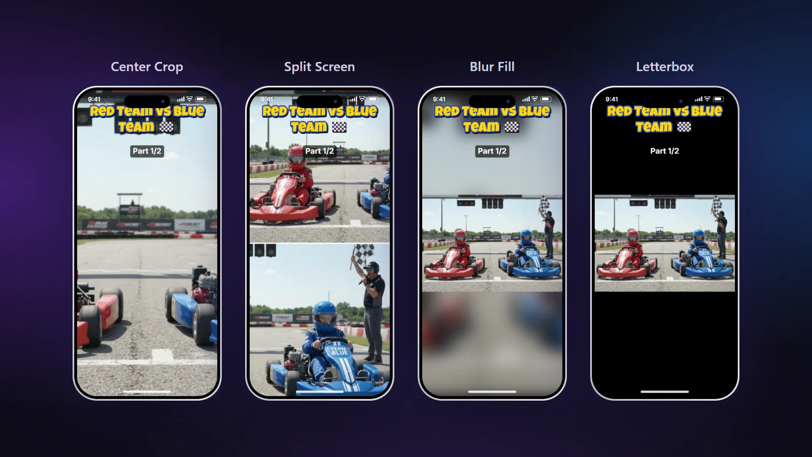
Blur Fill is the layout you choose when nothing may be cut off. The whole wide video sits in the middle of the tall frame, and the space above and below it is filled with a soft, blurred copy of the same picture. The result looks intentional instead of empty.
When nothing can be cropped
- Slides and screen recordings: text at the edges would be lost in a crop.
- Game footage: the interface sits at the corners.
- Landscapes and architecture: the width is the point of the shot.
- Group shots: everyone has to stay in.
The trade-off you are making
A 16:9 picture shown full width on a 9:16 screen is small: about a third of the height. You gain the whole scene and lose size. That is the right trade for a slide or a view, and the wrong one for a face, where a crop or Split Screen gives the viewer more to look at.
Five ways to fill a vertical frame
| Layout | Keeps the whole picture | Picture size | Look |
|---|---|---|---|
| Center Crop | No | Largest | Fills the screen |
| Split Screen | Two parts of it | Large | Two subjects stacked |
| Blur Fill | Yes | Small | Soft, modern |
| Letterbox | Yes | Small | Cinema bars |
| Colour Canvas | Yes | Small | Branded background |
Making Blur Fill look good
- Use it with titles. The blurred areas are the natural place for a title or a caption, because nothing important is underneath.
- Keep the safe zones in mind. The buttons and caption of the app sit over the lower part of the frame. Put the picture slightly above centre if the bottom is busy.
- Check the edges. A bright edge of the video against a dark blur is fine; a very busy blur behind white text is not.
Choosing between the quiet options
Blur Fill suits most casual video. Letterbox is better when the footage is meant to look like film and bars feel right. Colour Canvas is the choice for a channel with a brand colour, or when a blurred copy would distract from a clean slide. All three keep every pixel of the original in view.
Common mistakes
- Using Blur Fill for a talking face and wondering why it feels distant. Switch to Smart Crop.
- Placing text over the area where the picture and the blur meet, where it is hardest to read.
- Exporting a slide with small text at 540p. Keep 1080p when text matters.
Open the blur background tool, or compare all the layouts in our layout guide.