
Turning a wide video into a tall one always costs you something. Either you lose part of the picture, or you lose part of the screen. The layout you pick decides which. We've tried all of them on the same footage, and the right answer really does change from shot to shot.
All the examples below use one moment from our go-kart test video: the start line, with the red kart on the left, the blue kart on the right and a marshal with a flag.
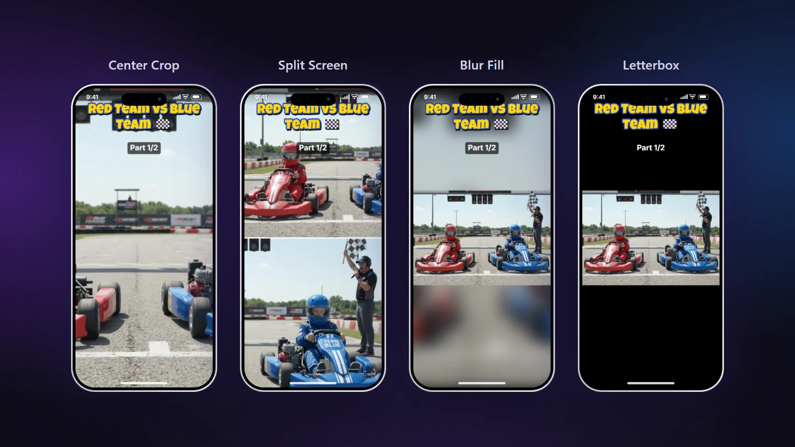
Center Crop
What it does: fills the whole 9:16 screen with a tall slice of the video, about a third of its width.
When it's right: one person or one object carries the clip. Talking to camera, a cooking demo, a pet doing something silly. Pair it with AI Smart Crop if the person moves, and the slice will follow them.
When it's wrong: two important things are far apart. On our start line the crop landed exactly in the gap between the karts. You get track, half a wheel on each side, and no drivers. It looks like a mistake because it is one.
Split Screen
What it does: stacks two slices of the same video, one above the other, each with its own position and zoom.
When it's right: two people in a wide shot. Races, interviews across a table, two players, a reaction. Each person gets half the screen, which is much bigger than they'd be in a full-width picture.
When it's wrong: there's only one subject. Two halves of the same person, or one half of empty track, looks odd.
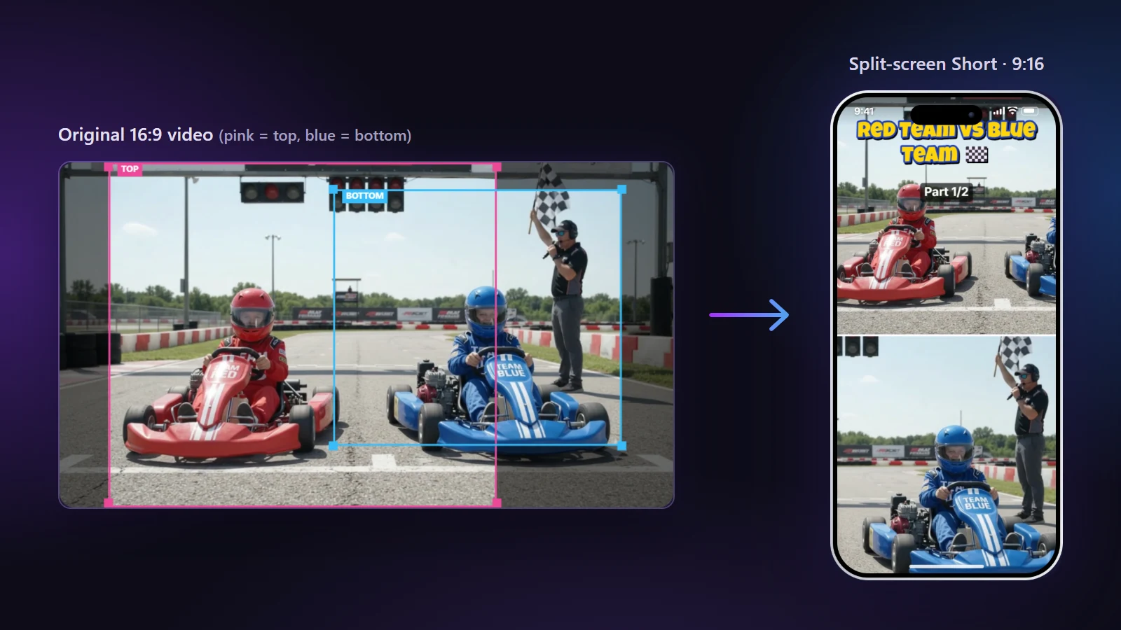
On the go-kart video, AI Split Screen found both drivers on its own and kept following them. We only had to step in at the very end, when both kids stood together and the halves showed the same scene twice.
Blur Fill
What it does: shows the entire wide picture in the middle of the screen, on a soft, blurred copy of itself.
When it's right: nothing can be cut off. A landscape, a slide, a game with its interface in the corners, a group photo moment.
The catch: the picture is small, about a third of the screen height. The blurred band hides that well, and it's a natural place for a big title. If the edges of your video aren't important, zoom in a little to make the picture bigger.
Letterbox and Color Canvas
What they do: the same as Blur Fill, but the empty space is black bars or a flat colour of your choice.
When they're right: Letterbox suits footage that's meant to look like film. Color Canvas suits a series with a brand colour, or a slide where a blurred copy behind it would be distracting.
How we decide in practice
| What's in the shot | What we use |
|---|---|
| One person talking | Center Crop, with AI if they move |
| One person moving around a lot | Center Crop + AI Smart Crop |
| Two people far apart | Split Screen, with AI to place the halves |
| Scenery, slides, screen recordings | Blur Fill |
| Film-style footage with a big title | Letterbox |
Mixing layouts in one video
Real videos change. Our go-kart clip starts with two kids talking, moves to a start line with both karts, and ends on close-ups. One layout for all of that is a compromise.
In the Framing tab you can press Change at at any moment and pick a different layout from there. Split Screen while two people are in shot, Center Crop for the close-up, Blur Fill for a wide view of the track. Each section keeps its own framing, and the export switches at exactly those times.
Common mistakes
- Leaving a Center Crop unchecked through a scene change. When the subject walks out of the slice, the Short shows whatever was behind them.
- Using Split Screen for one person "because it looks cool". It doesn't.
- Putting a title right where the blurred band meets the picture. That edge is the hardest place to read text.
Each layout has its own feature page if you want the details: AI Split Screen and Blur Fill.