
A title can look perfect in an editor and slightly broken on a phone. In the diagram below, our title sits right under the app's header, so the top line is half covered. Nothing is wrong with the video itself. The app simply puts its own controls on top of it.
YouTube Shorts, Instagram Reels, TikTok and Facebook Reels all play your video full-screen and then draw their own buttons and text over it. Anything you place under those controls ends up half-hidden. Once you know where the controls go, it's easy to avoid.
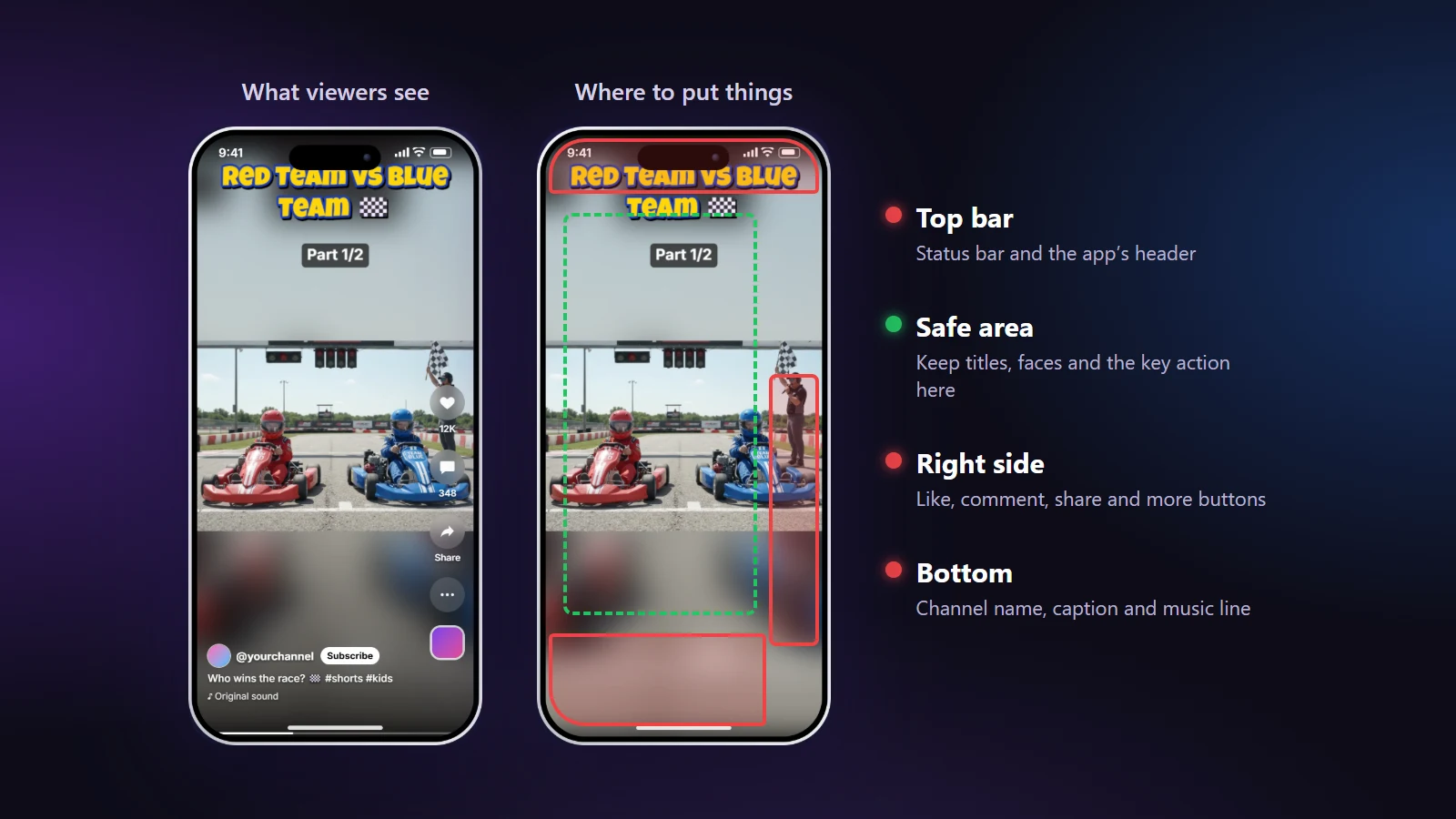
The four areas
- Top, roughly the first 8% of the height: the phone's status bar, plus the app's own header with search and the camera button.
- Right side, roughly the last 18% of the width in the lower half: like, comment, share, remix and the spinning sound disc.
- Bottom, roughly the last 20% of the height: channel or account name, the follow button, your caption, the music line and the progress bar.
- Everything else: yours. Titles, faces and the main action belong here.
The exact sizes change between apps, phone models and app updates, so treat these as comfortable margins rather than pixel rules. If you stay inside them, you're fine everywhere.
See the buttons while you edit
In the NineSixteenAI editor there's a switch above the phone preview called App buttons. Turn it on and the preview draws a typical set of controls over your video: the like and comment buttons, a channel name, a caption and the music line. Drag your title until nothing overlaps, then switch it off again to see the clean picture.
It takes about ten seconds and it catches the most common mistake before you export, not after you've posted.
Where each thing should go
- Titles: upper middle, just below the header area. Somewhere between 10% and 25% from the top works on all four apps.
- Part labels like "Part 1/3": right under the title, so they read as one block.
- Logo: top left. The bottom right is where the buttons are, so a logo there disappears.
- Faces: the middle third of the frame. That also helps on Instagram, where the profile grid crops the edges of your Reel.
- Captions or subtitles: above the bottom fifth. Subtitles that sit in the usual "TV" position at the very bottom collide with the app's caption.
Layout by layout
Center Crop: the hardest case, because the picture fills the whole screen and every corner is covered by something. Keep the person in the middle and the title near the top.
Split Screen: the dividing line sits halfway down, which is safe. Keep each person's face in the middle of their half, and don't let the top person's head sit under the header.
Blur Fill and Letterbox: the easy ones. The empty band above the picture is the perfect place for a big title, and nothing important is underneath it.
Quick checks before you post
- Turn on App buttons and scrub through the whole clip, not just the first second. Text that's fine at the start may sit on a face later.
- Look at the clip at phone size. If you have to squint at the title on a laptop preview, it's too small on a phone too.
- Read your title without sound. If it doesn't make sense on its own, people scrolling with the sound off won't get it.
Every platform's use-case page has its own notes on this. The Instagram Reels workflow covers the profile grid, and the TikTok workflow covers the side buttons.